Work · Clean care · rebrand
Cleure
Leading a dentist-founded clean-care brand through a rebrand, as its de facto CMO.
Challenge
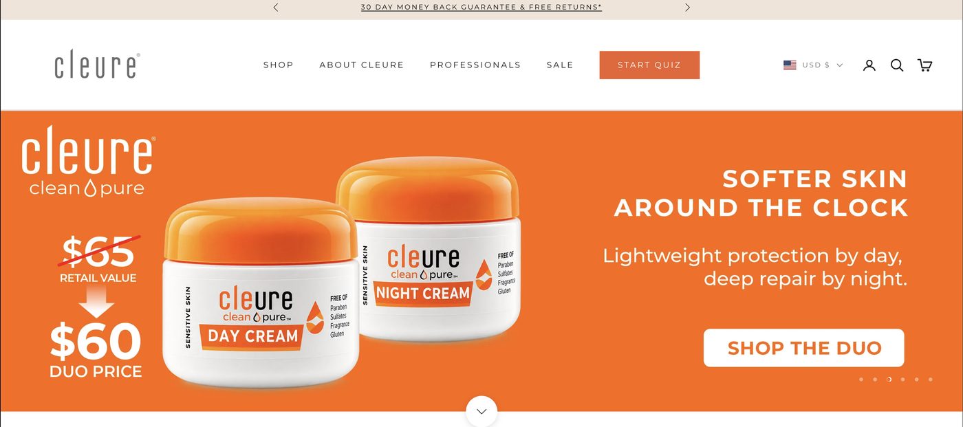
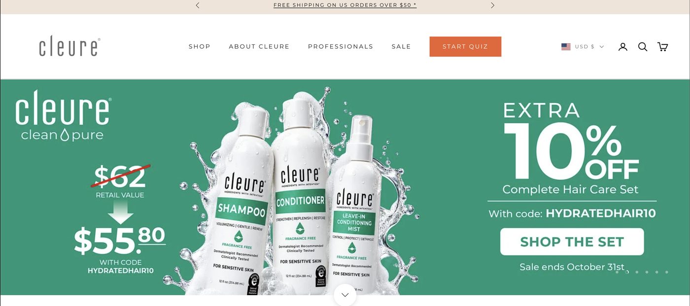
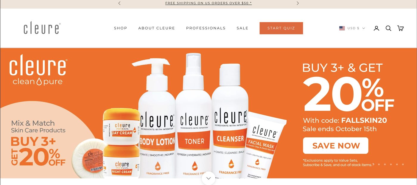
Cleure's products were made for sensitive skin and mouths, free of the usual irritants. But the brand looked like a discount pharmacy line: loud orange banners, price slashes in every hero, and a thin wordmark that disappeared. The story got lost.
Insight
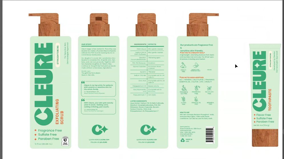
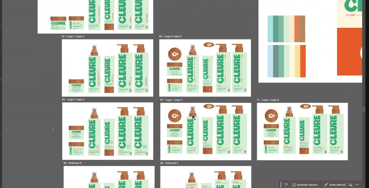
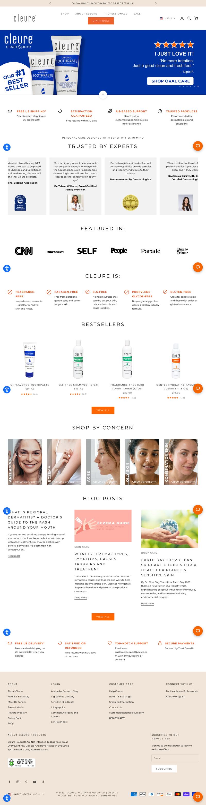
The proof was already in the formulas. The brand needed confidence: a bold, stacked wordmark, a calm clinical green, and natural warmth from wood-grain caps.
What I made
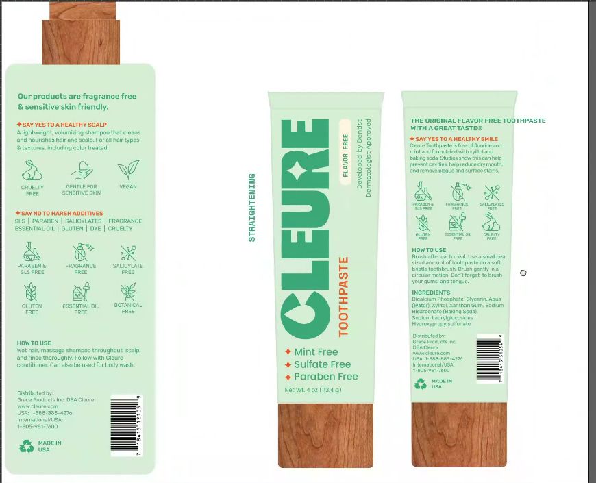
I wrote the brief and directed creative director Blake Vallotton (Grüns, ex-Taco Bell) through the system. That covered the logomark, a vertical wordmark, a packaging architecture across toothpaste, scrub and hair care, and the claim hierarchy on every panel.
What it did
The brand moves from discount-led promos to one confident packaging language. It scales across the line and makes “free of” claims easy to read at a glance.
Credit
Design by Blake Vallotton under my creative direction.